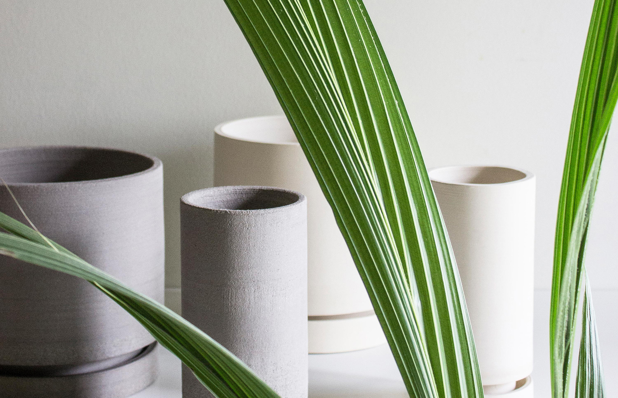
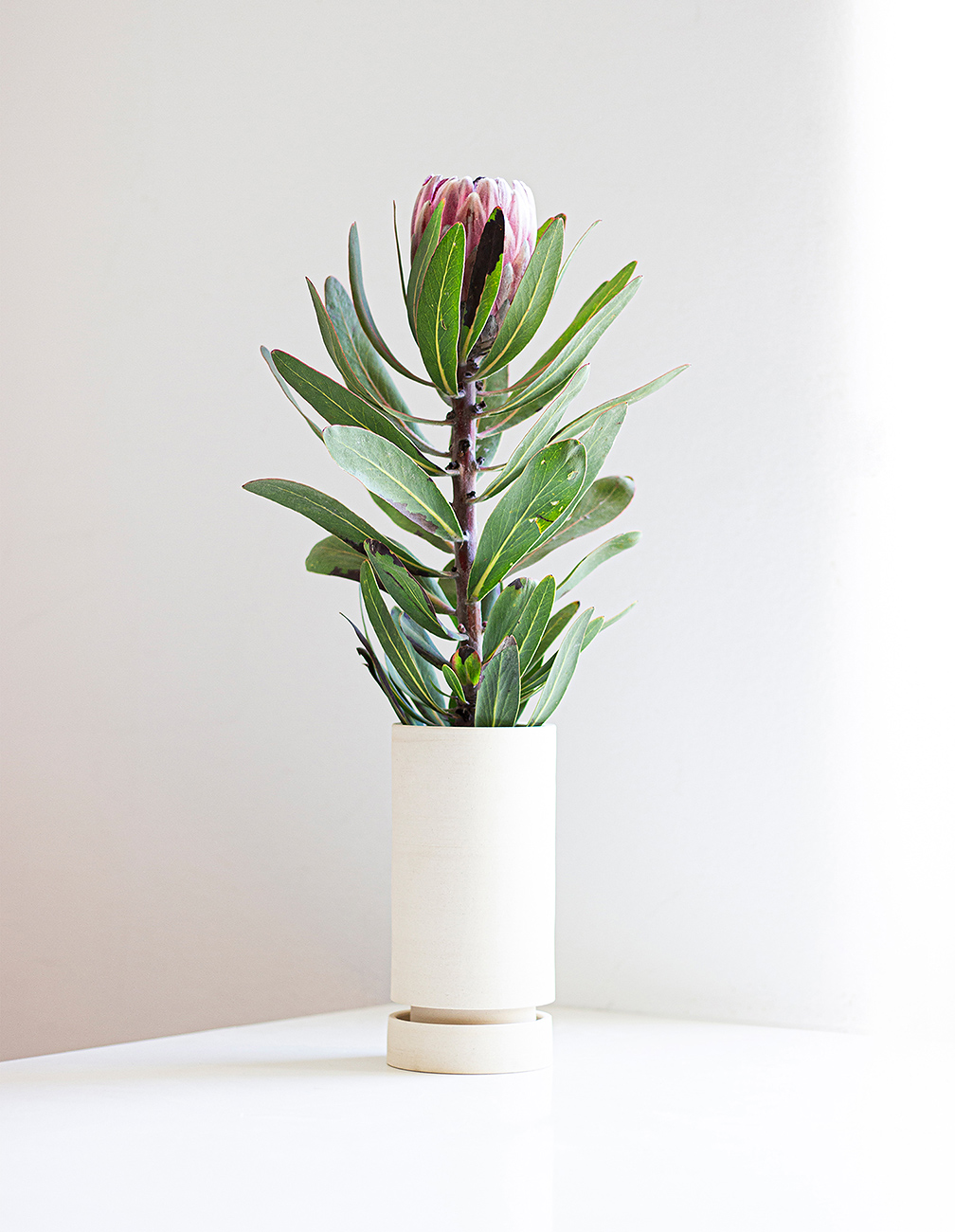
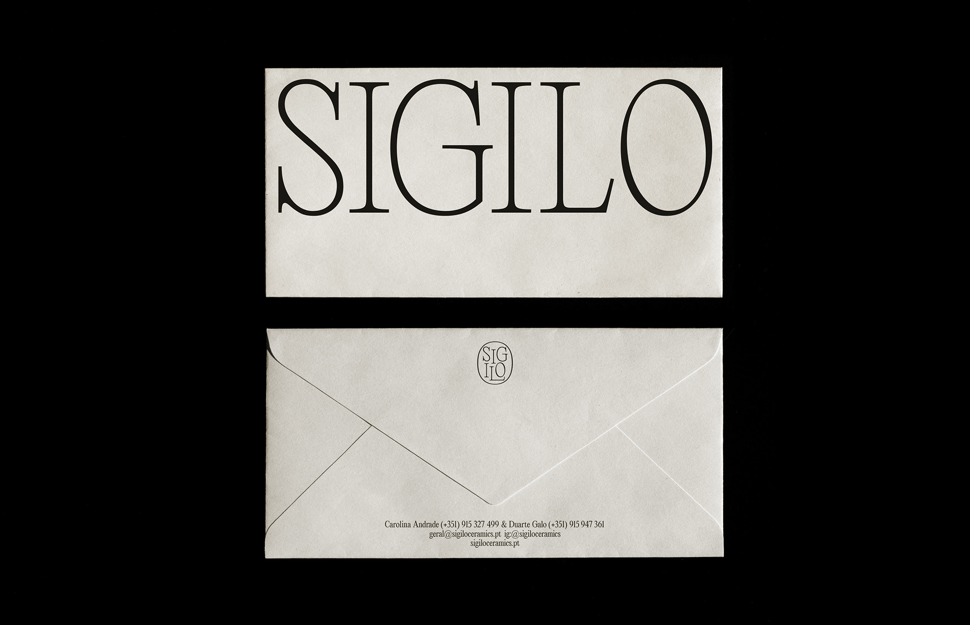
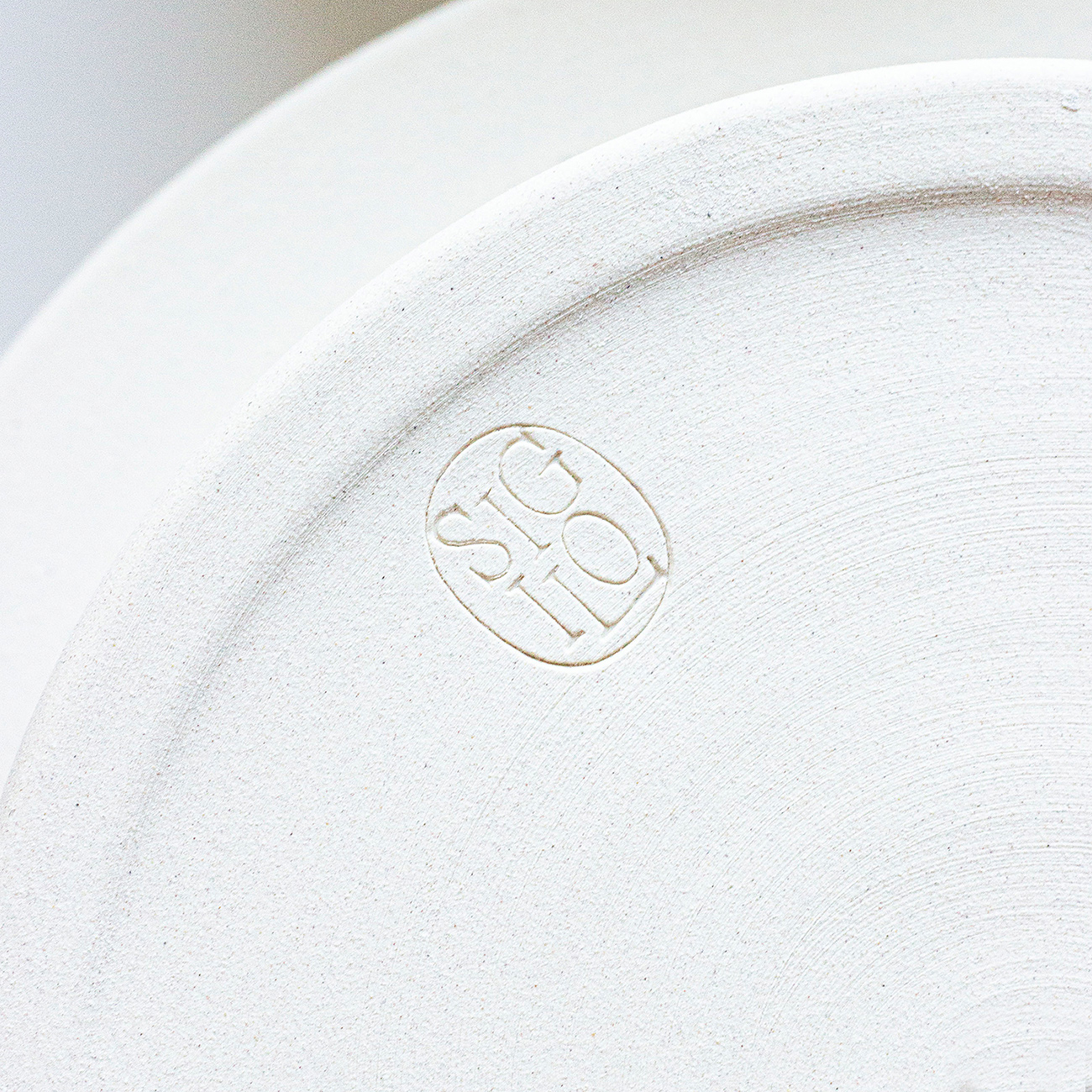
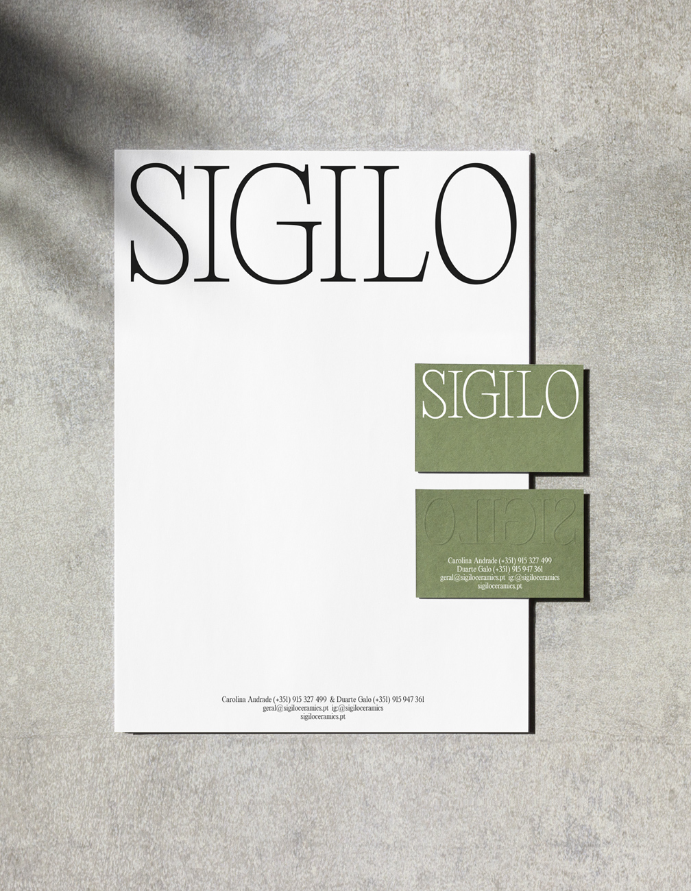
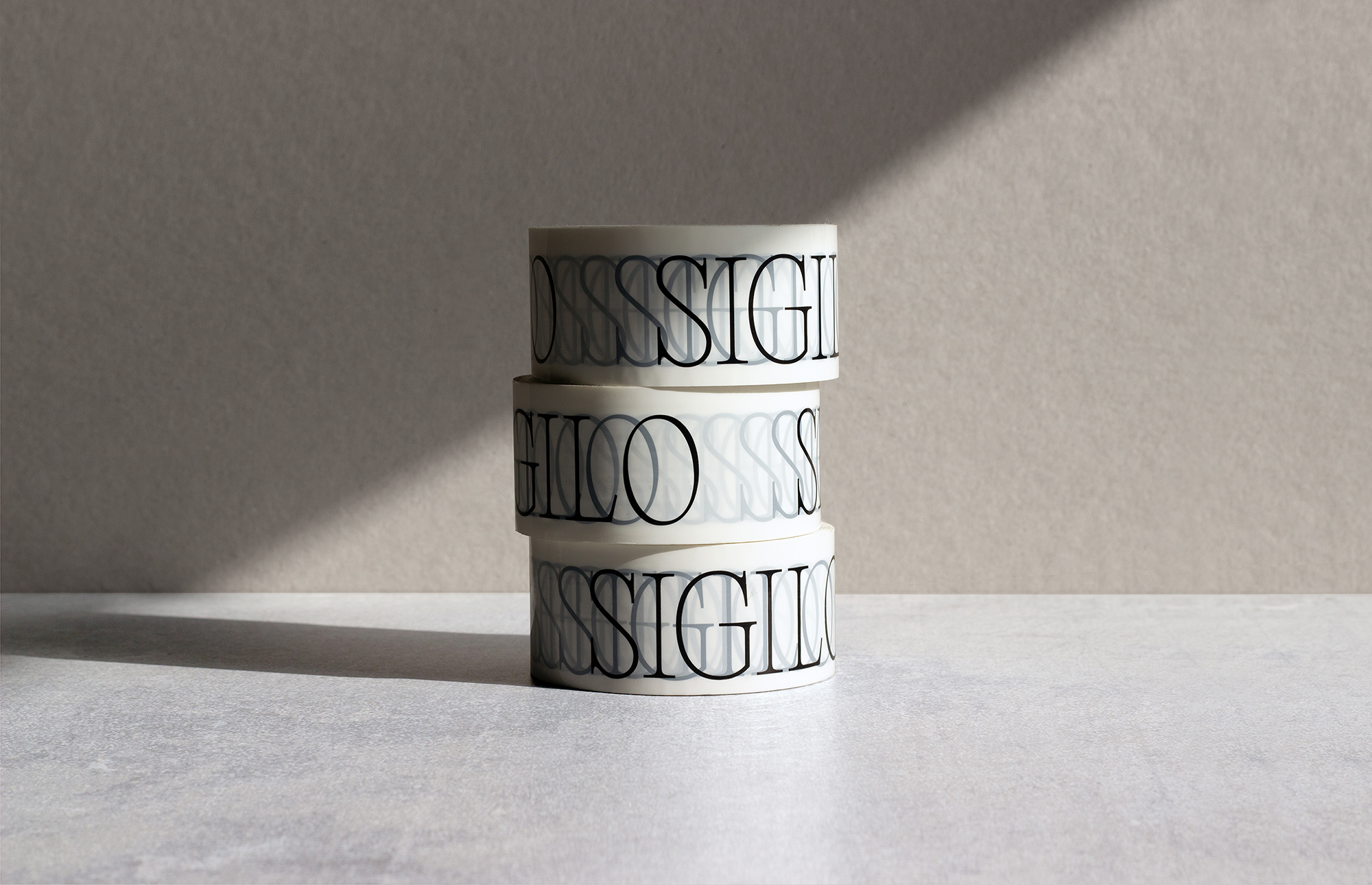
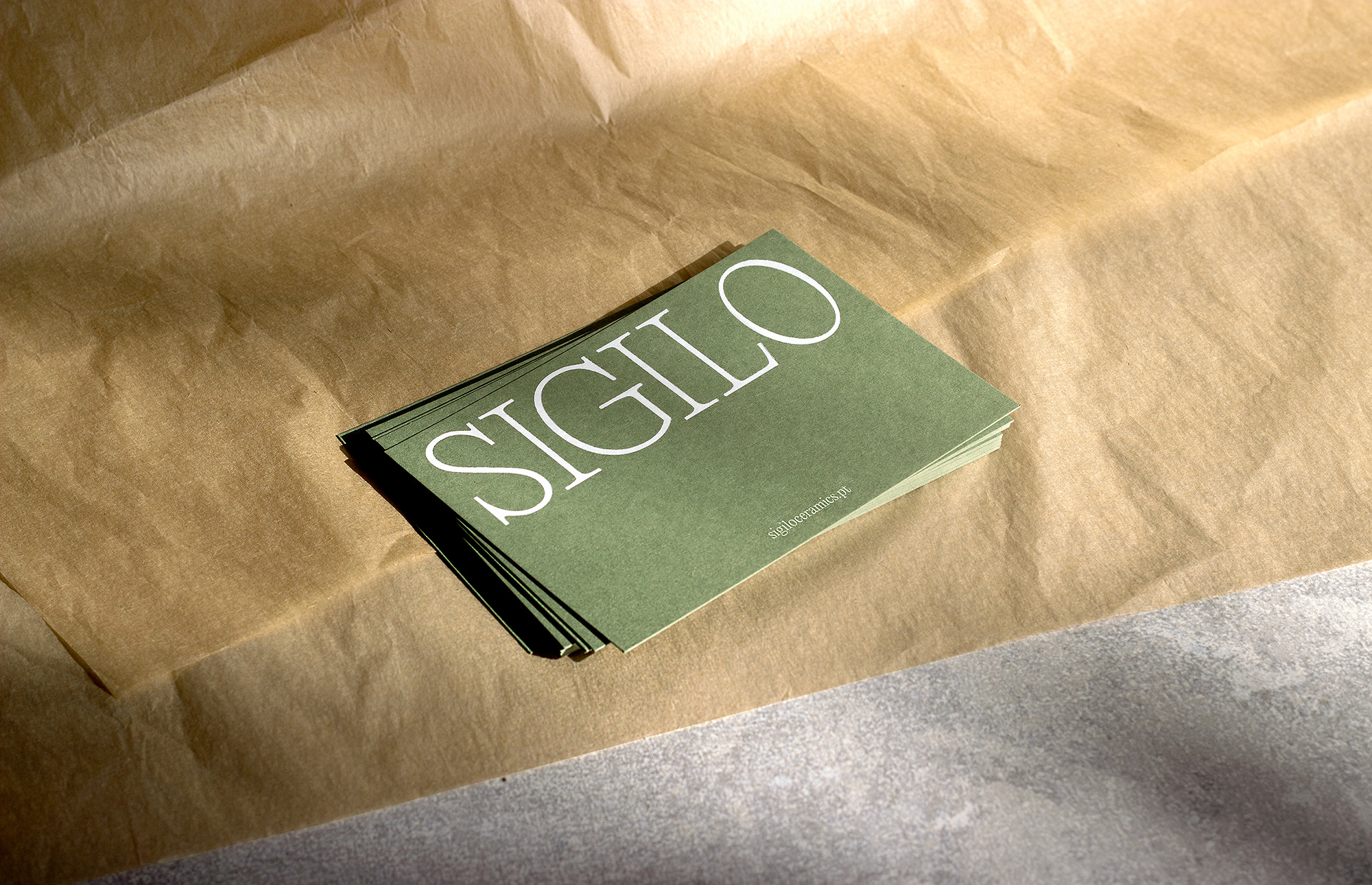
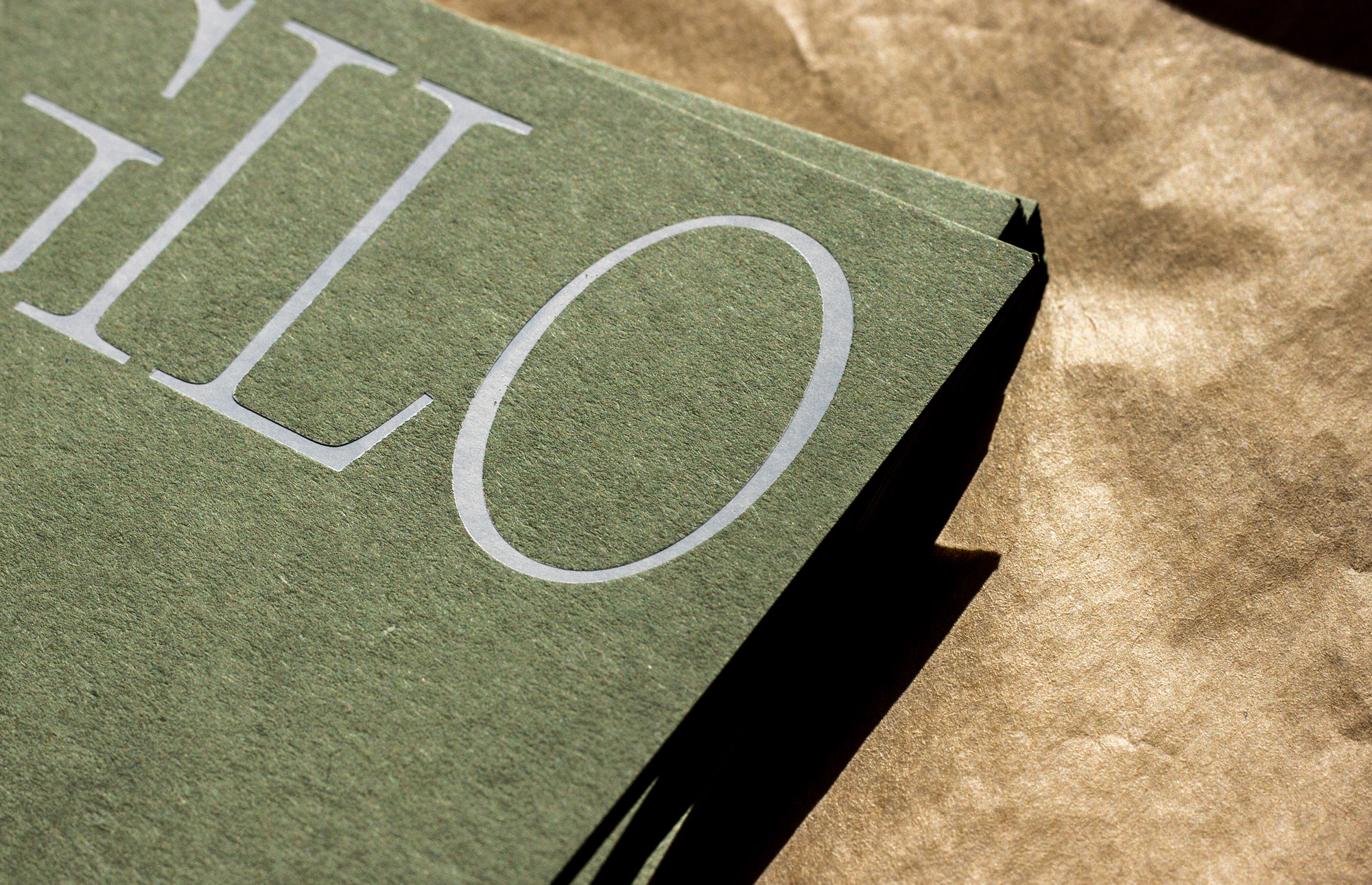
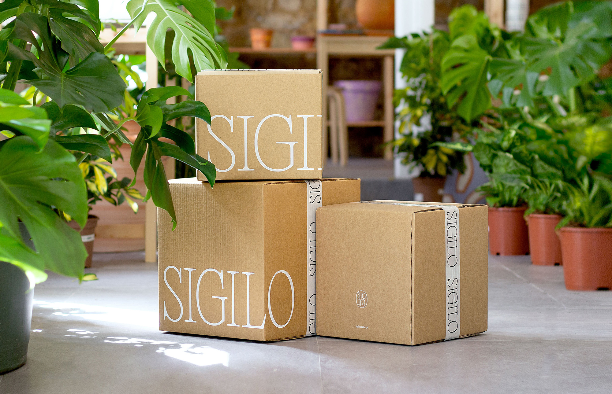
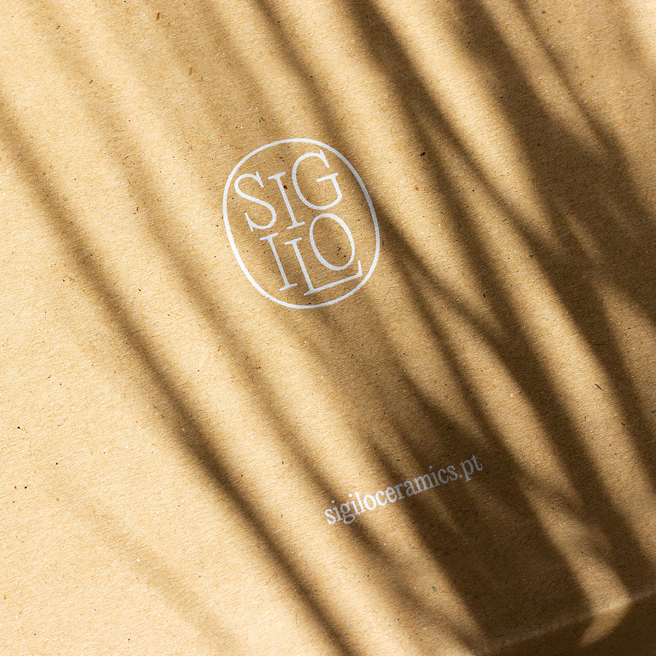
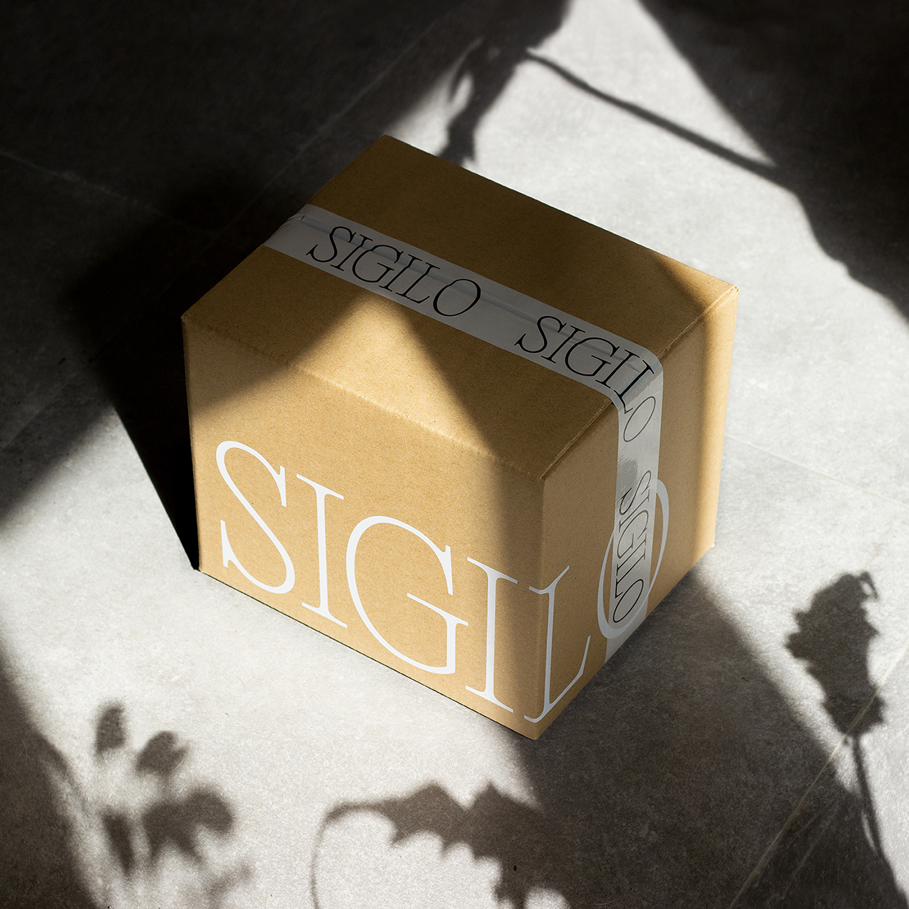
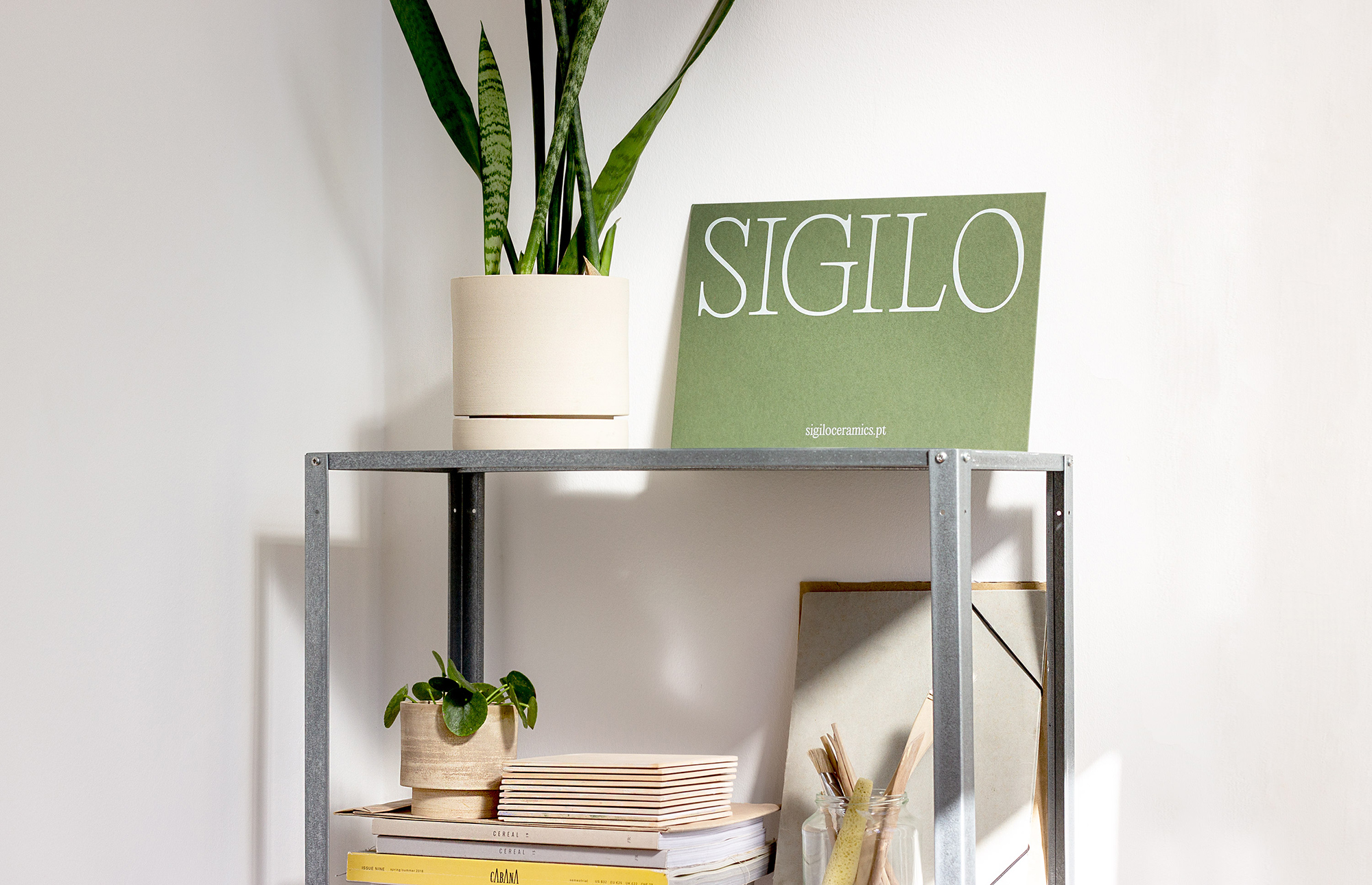
Sigilo explores the relation between plants and human beings and their mutual needs, such as light, space and food. Privileging the use of typography, the wordmark Sigilo uses the space to show its essence without compromising its natural elegance. The same typeface is used throughout the identity with an honest treatment, allowing each element to find its place in harmony with the brand’s raw details. The color scheme is a reflection of life and object duality of the product. An honest typographic treatment is used throughout the entire identity, allowing each element to find its place in harmony with the brand’s raw details.


